Mistikyte on K
To see a collection of just finished images instead of background material and works in progress, see: New Stuff.
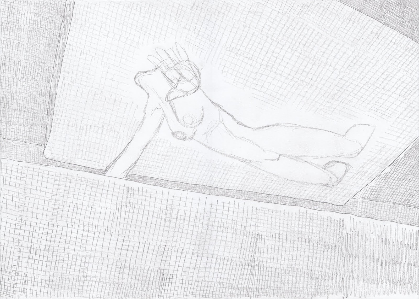
I will use this page as a kind of "how do I?" I will show how Mistikyte on K 1 (see: New Stuff) was created from the first sketch to the finished image, and describe a few things I've learned since. Your first question may be why am I doing the initial drawing using a pencil on paper instead of doing the initial drawing in Photoshop? My rationale is to do with the size of the screen. It is possible to buy computers with huge screens like big screen tvs. But these cost a fortune and are quickly superseded by faster computers. Maybe there is a way to link an ordinary computer with an ordinary big screen tv, but I haven't looked into it. My view is that an ordinary computer does not offer screen resolution adequate to have the whole image on the screen at once at an adequate resolution when working on the image as a whole. On a large sheet of paper, you can see the rest of the image with your peripheral vision even while working on fine details. But other digital artists appear able to make it work, so maybe it is only a case of not being able to teach an old dog new tricks. The same argument could be made in relation to colour, but I think mapping out a colour scheme does not suffer from the same resolution demands. In any case, the statements I make apply the same whether we are talking about sheets of paper on a light pad, or layers in Photoshop. There also tends to be a small time lag when sketching on a computer. It takes a moment for the lines to appear, which is a hindrance when sketching. I don't find this a problem with "inking" (black linework) and colour, as these are slower processes than sketching.
When sketching, every once in a while I can spontaneously draw a nice human figure, but most are not. When preparing a finished image you have to make it work, and you don't really have the benefit of spontaneity. So unless you're a prodigy, it's likely to be a hard slog. The first sketch doesn't do much more than map out the scene, where you will put all the elements. Then with each iteration you look at what's wrong and fix it. It may not be easy for you to see initially the right way to do it as you are drawing, but once you've drawn it, it's usually easy to see what's wrong. For you and for any passers by, whether or not they are artists themselves. It may not be immediately obvious from the initial sketch what is wrong with it because it is only a few lines, but once you begin to flesh out the shapes this will become obvious.
Okay, so the legs and feet are too small, and the face looks like it's been hit with an iron. Only the hands and breasts look okay. When you are concentrating on drawing a particular piece of the body, it's easy to lose sight of the proportion it should have relative to the body as a whole. We can either shrink the head and torso to match the legs, or make the legs bigger. I wanted an intimate view for this scene, so I don't want to shrink the torso, and I'd like to keep the whole figure in the scene. This will be difficult for the legs, but foreshortening may help us out. I want to spread the legs wider in any case.
Her legs are a little better but still not there. Her butt shouldn't have such a wedge shape. Her face is only slightly less flattened. All we did with the hands, arms, breasts and upper torso was clean them up a bit. We still need to spread her legs wider. That will turn the near leg towards us and the far leg away from us. That's where foreshortening should help keep the legs in the frame.
I've cleaned up the basin she is over a bit. There are no particular challenges here. We will look at perspective shortly. For now all you need to know is that a circle seen from an angle (obliquely) is always an ellipse. Don't get the idea that it will be egg shaped because one side is nearer to you and therefore affected by perspective. It's still an ellipse. And the ellipse is always perpendicular (at right angles) to the viewer, regardless of the orientation of the surface. The way we get perspective with an ellipse is when we have an inner and outer ellipse. Notice that the outer ellipse in the basin above is pulled toward us relative to the inner ellipse, so that the far edge is narrow and the near edge is fat. A circle seen face on is a circle. A circle seen side on is a straight line. A circle from any other angle is an ellipse. A sphere is a circle from any angle whatever. We want the woman's butt to appear midway between the near edge and the far edge of the basin, so imagine a horizontal line defining the major axis of the inner ellipse. Then decide how far along this line you want her butt to be, then imagine a vertical line going up from that point the distance above the line that you want her butt to be. That's where you draw her butt. Since we drew her butt first, the same rule applies in reverse when positioning the basin. I've also started adding some background so we have an idea of the finished scene.
We've got to do more work on the figure and don't really want to have to redraw the whole scene each time. So we take advantage of the light pad and draw the elements separately (if we are doing all of our drawing directly in Photoshop or something comparable, you can achieve the same result using layers). The previous draft mapped out the background elements and we can utilize this to develop the background separately later. I'm still thickening up and turning the legs. At this point I make a silly mistake. In the previous draft we were looking at the top surface of the near foot, while in this draft, because we have turned the leg more, we are looking at the underside of the near foot. But I forgot to reverse the order of the toes, so now I have the big toe on the outside of the foot. The face is approaching a proper shape.
Her legs are starting to spread apart more now. Which means the near leg is now closer to us, and therefore larger, so we thicken it up. Because it is turned toward us, foreshortening keeps it from extending out of the frame. "Foreshortening" refers to the fact that things look shorter when viewed at an angle, than when they are viewed side on. If you view something end on, you don't see any of its length. I still haven't realised I have the toes on backwards. I'm pretty happy with the face now. The butt and groin is also getting more rounded, less wedge shaped.
I finally realise the toes are on backwards and decide to draw the reversed foot on a separate piece of paper. At the same time I thicken it up between the sole and the top surface of the foot.
Since I'm now more or less happy with the human figure I can focus on the environment. It will be easier to draw this without the human figure to begin with. At this point we need to know a little more perspective.
Imagine you are standing in a vast featureless desert, looking straight ahead. The only feature you see is the horizon in the distance where land meets sky. It's a horizontal line across the scene. In the image above you will see a straight horizontal toward the top of the image. At each end of this line you will see a tiny little feature. Each of these features is actually a tiny little circle on a short stalk, sticking up from the horizon. That is how I usually indicate the horizon in my pictures. The little circle on a stalk is supposed to represent a stylised tree on the horizon. That is how I indicate the horizon line, distinguishing it from any other horizontal lines the image may contain. From a perspective point of view, figuring out where the horizon is, is the first, most important thing to identify. If your scene is busy, full of foreground objects, hiding the horizon, imagine they are all slightly translucent so that you can see the horizon through them, and draw this horizon into the picture. Imagine you are standing in the featureless desert and that you can always see this through all the other objects.
If you look up, the horizon line goes down. If you look down, the horizon line goes up. If you tilt your head to the left side, the left side of the horizon line goes up, so the horizon tilts. If you tilt your head to the right, the right side of the horizon goes up. If you look down at your feet, the horizon won't be visible. The same if you look up at the sky. Sometimes you may find it worthwhile to attach an extra piece of paper to your drawing, to determine and show the horizon. But there are other methods. Now imagine you are standing on a straight road in the otherwise featureless desert. The road goes all the way to the horizon. The two sides of the road are parallel, but they appear to converge, meeting at a point on the horizon. We call this point the "vanishing point". Now imagine looking to the left where you can see another straight road, parallel to the first. The edges of this road will also converge on the horizon, and because this road is parallel to the road we are on, its edges will converge on the same point on the horizon as the edges of the road we are on. If we imagine that the desert is covered in a vast grid of straight roads, all parallel, their edges will all converge on the same vanishing point.
Now imagine, by the road there is a large rectangular building. The side of the building facing us is parallel to the road. And because the building is a rectangular prism containing other rectangles and rectangular prisms, the edges of these will also be parallel to each other, and therefore their edges also point to the same vanishing point on the horizon. The top edge of the door. The top and bottom edge of each window. If a rectangular table in the building, or a rectangular door mat out front are aligned with the building, their edges will point to the same vanishing point on the horizon. The space in our universe is made up of 3 dimensions: length (distance: depth, near or far), breadth (to the left or the right), and height (above or below). Now imagine in your desert, 3 axes, 3 perpendicular straight lines. Don't imagine the 3 lines as drawn on the page, but imagine them as actually suspended in the space in front of you, nearby. Imagine that the 3 lines meet at a point in the space near you. Each of the 3 lines is perpendicular to the other 2, like the three edges of a box meeting at the corner. One of the lines points to the horizon and represents depth, near or far. Let's call this line "z". Another line points to the right and represents breadth: distance to the left or right. Let's call this line "x". The third line points straight up and represents height. Let's call this line "y". Now imagine the z line passes straight through the middle of a cube, and that the edges of the cube are parallel to the z line. Now imagine we can rotate the cube around the z line, using the z line as an axis of rotation. This rotation does not change the fact that the edges of the cube are still parallel to the z line, and so regardless of how it is rotated, as long as it is around the z axis, the edges remain parallel to the z line, and therefore point to the same point on the horizon.
Now look again at the picture above. You will see on the left side, a vertical wall. On the wall are lines pointing to a point on the horizon line. Notice at the bottom, the wall is no longer vertical, but its edges still point to the same point on the horizon line. Now consider the large wall on the right side of the image. This wall is not parallel to the wall on the right side. In fact this wall has a slight curve to it so that one section of this wall is not parallel to the next section of the wall. Imagine our x, y and z axes again, and this time, that the y-axis goes straight through the centre of a cube which has its sides parallel to the y-axis. This box can rotate around the y-axis, using the y-axis as an axis of rotation. Because the y-axis is perpendicular to the z-axis, we can rotate the box in such a way that its edges are parallel to both the z-axis and the y-axis simultaneously. So that the edges of the box all point to the same point on the horizon. Now consider what happens when we rotate the box slightly around the y-axis. The edges of the box will all still point to a single point on the same horizon, but it will be a different point on the horizon, than they were pointing to at their previous orientation. As we rotate the box around the y-axis, the vanishing point for its edges move along the horizon. Look again at the wall on the right side of the image above and you can see that different sections are pointing at different vanishing points on the same horizon.
We don't really have an example of it in the image above, but we can also imagine rotating a cube around the x-axis. At a certain orientation, this cube will be parallel with all three axes, but as we rotate it around the x-axis, at each orientation, the edges will point to a single point on a different horizon line. The box is tipping up or down.
If our line of sight is perpendicular to the front of a box, the front has no perspective, but we may still see some of the side of the box. The top and bottom edges of that side will converge to a point on the horizon. All the edges of the box will either be perpendicular to our line of sight and have no perspective, or they will converge to the same point on the horizon. Thus we call this "one-point perspective". If our line of sight is not quite perpendicular to the front of the box, the front of the box will have perspective, but its edges will not converge on the same vanishing point as those of the side. So we have two vanishing points. Both these vanishing point however will be on the same horizon. We call this "two-point perspective".
The vanishing point may not be on the piece of paper you are drawing on. It may be off to the side some distance. In this case you may stick another sheet of paper to the side of the first, and extend the horizon so you can mark the horizon on it. In the case of two-point perspective it is highly unlikely that both vanishing points will appear on the piece of paper. The most common novice mistake in two-point perspective is having the two vanishing points too close together, creating a fish-eye lens effect. Sometimes the vanishing point is way way off to the side. Too far to just keep adding extra sheets of paper to extend the horizon. So what do you do? In this case, rule in one of your perspective lines, running it off both sides of the piece of paper. As a guide when drawing this line, just choose whichever part of your initial sketch that seems to have the most accurate perspective. If the distance between this line and the horizon is 3 cm on the left edge of the page. Then mark off more 3 cm intervals up and down the left side of the page. If the distance between the line and the horizon is 5 cm on the right edge of the page. Then mark off 5 cm intervals up and down the right side of the page. Then join each 3 cm mark on the left to the corresponding 5 cm mark on the right and you have your perspective grid for an invisible vanishing point. You can see this in the image above, which is an earlier draft of an image from Ziegler's Brain. There is also such a thing as "three-point perspective". Imagine you are also looking up at the box, so there is another vanishing point high in the sky. (Or looking down on the box. See for example Newgrove Mansion on Newgrove.) Note that if you are representing a wide-angle view, straight lines will not appear straight. Thus ends our lesson on perspective.
In any case, I decided there were too many basins on the wall and rearranged their location. The foreground bowl is now quite defined. It has some mud and water grass in it. All the bowls are filled with water. The wall on the left now has some small human figures suspended in front of openings in it.
Here I have just been cleaning up the image. The object suspended at the top left of the picture is a support for the woman's head. A head rest.
The foreground bowl is pretty much finished, so we don't want to have to redraw it each time as we finish off the background. I've also removed the background women and can finish them off separately. If you're wondering what the little blank white spaces are at the top left and top right of each image are, this is where the sticky tape attaches the paper of the new draft to the paper of the previous draft.
The women in this image are all in harnesses, so we need to make a start on the harness of the foreground woman. We also want some women in the other bowls. I've also added a water flower to the foreground bowl.
I continue working on the foreground harness, water flower and the background women.
I continue working on the foreground harness, water flower and the background women.
The harness and flower are pretty much done now. But the background women must have their own harnesses.
So now we just work on the background women in their harnesses by themselves.
Now we are up to some finishing touches. I define the surface of the water in each of the bowls, and indicate the shine on the water.
The harness of one of the background women needed some extra work.
Now it's time to start combining the elements we have been drawing separately. We could try to combine all the elements at once in the next draft, but I worry that I will get lost if I attempt this. There is a danger in drawing elements separately in that you lose the sense of the scene. The lighting on objects is affected by the objects around them. So we need to start combining the lighting conditions of the various objects. This might be a good time to talk a little more about the human figure.
The human figure is difficult to draw for all sorts of reasons. First of all there's all the anatomy you need to know, and there's no way around this. You need to know how the skeleton fits together and how the flesh is attached to it. You need to know how the muscles are bundled and aligned, and how fat deposits affect the appearance of the body. Once you know all the anatomy you note that no two people look the same. People have different proportions. Some people have more fat, some have more muscle. How the fat and muscles appear on the body depend on the position and orientation of the body. If the muscles of one leg are under tension and the muscles of the other leg are not, the left and right leg are different shapes. Tense muscles bulge. Loose muscles hang. As people do more or less of different exercise or activity, different muscle groups are built up or dwindle or turn to flab. So that the same person's body is always changing even aside from ageing. Given all of this there is also something very peculiar about the way light behaves on the human body. Looking at the light and shadow on the human body can leave you completely mystified.
Most objects treat light in a straight forward and predictable way. You just think about where the light is coming from. What other objects it is bouncing off. Whether the object is shiny or matt, rough or smooth. The weirdness about light on the human body is caused by a phenomenon known as "sub-surface scattering". Flesh is slightly translucent. If you hold up a light behind your hand, you can see the light shining through it, but that doesn't mean you can see the bones in your hand, because as the light passes through your hand, it bounces around inside (sub-surface scattering), blurring the bones. Sometimes the skin is shiny, such as when it is wet or sweaty, or from women's makeup or ointments, so that it might have subtle, metal-like shine and reflections. All of these factors about the human body combine so that, as an artist with a pencil, wondering how to proceed with a piece of shading, the answer is often: "God knows". When it comes to perspective, I am quite analytic. But most of the time I consider myself an intuitive rather than an analytic artist. I trust my hand to know what to do as a result of what my eyes already know from years of perceiving the world. Do what "looks right". If it doesn't look right, try something else. You may be building up shading in a certain area and your eyes say "stop". And your eyes say: "you need a bit more over here". As a young artist you may not have this intuition yet, but with practice it will come. Which is not to say it cannot lead you completely astray if you rely on it too much. For instance, how do your eyes know the context and therefore lighting conditions of the object? That' where the analytic side comes in. Being analytical while drawing can interfere with visualisation, and the fun of drawing. Sometimes a line you enjoyed drawing is better than a line that is accurate. I draw a scene initially intuitively without analysing perspective or shading, and only later start considering perspective and lighting conditions as I refine the drawing. If you analyse too soon you probably won't end up with the scene you want. Sometimes intuition spots things you never would have guessed. Sometimes your reason is screaming: "It can't possibly be that way!" And it is only much later that you realise why it "looks right". This is true of light and shade, and also of the way colour behaves. If your picture looks good, you can be forgiven a lot of inaccuracies, but more often than not, if it looks good, it is probably also the right way. As you learn more anatomy or whatever over the years, they will get more accurate.
A new draft introduces the remaining elements and we have a finished pencil ready for scanning. This is the technique for drawing I have evolved over the years. Quick it is not. Some may describe it as manic. But it gets me to where I want to go. It has the neatness and polish and control that I want. I have been drawing in this way for many years now. Most pictures are not as difficult as Mistikyte on K 1. Many pictures I do not bother breaking up the scene to draw individual components separately. When drawing real world objects, you often need only a gesture to indicate what the object is, but in science fiction we are often drawing objects that do not exist, so we need to give the viewer more clues about what the object looks like. You'll notice the earlier drafts had more subtle shading. I block out the shading in the final version as a guide for doing the shading in Photoshop.
An A4 scanner is cheap, convenient and easy to obtain. An A3 scanner is dramatically more expensive, and an A2 scanner is crazy expensive. Since scanners may break after a few years, and when they do, it may be cheaper to buy a new scanner instead of attempting to get it repaired. So expensive scanners aren't a good investment unless you're a company with a big enterprise scanner and a contract with the vendor. So I use my little A4 scanner. This means scanning an A2 drawing is a real pain. It typically takes 4 A4 scans to get all of an A2, but I have had occasion to take as many as 6. 4 of them are as you would expect, 4 A4 frames making up an A2 page. But these scans may leave a small gap across the middle of the picture, and it may take another 2 horizontal scans to capture this. Scanners typically have a lid that lifts up, and this lid gets in the way of positioning the page with large sheets of paper. I haven't attempted to remove this lid. Plus getting a large piece of paper straight on an A4 scanner is a challenge. So that the separate scans quite often don't exactly line up. You of course always have the option of taking your artwork to a shop that offers A3 and A2 scanning, but depending on the nature of your work and your expectation of the printer's reaction to it you may not be comfortable doing this. If you work in an office, you might sneak in of an evening to use the document centre, but some of the monitoring on these devices in offices is getting quite sophisticated.
I am as of this writing, still a novice in Photoshop. And as of this writing I have not read the manual. I am usually good with reading manuals on software, but for some reason have never been good about reading how to do art. There is usually something more interesting to read, so instead I just jump in and start working, learning by trial and error. One of the challenges of working on a tablet is not accidentally leaning my hand on buttons and activating some function I didn't intend and don't know about. Then having to try to figure out what button I leaned on and what it does.
I have a set of templates: An A2 template, an A3 template, an A4 template and an A5 template. Each template is larger than the paper size it represents. It has a thin black border framing the paper size, surrounded by a generous white border (margin). Back in the Bay days I started to experiment with irregular comic book frames (see Bay 22), but I find these graphic gimmicks interfere with the cinematic quality of the story. And this means I can keep drawing on the standard photocopy paper sizes (A3, A4, A5), and cartridge paper (A2), without having to worry about defining irregular frame sizes. This also makes my "comic" modular so I can change the story and rearrange the frames.
If I have an A3 image, I open my A3 template. Just a flat psd file with a white background and a black border. Then I paste in my scanned pencil image as a new layer. I don't merge this layer because at the end I will make the scan invisible. Then there's a few standard layers I add. First is the "lines" layer on which I draw the black linework (since this is comic book art). This is typically the topmost layer. All the colour work goes on in layers beneath the linework layer, and I do the linework before I do the colour.
Not all the pencilled linework may end up as black linework in Photoshop. Some of it may be done in colour for a more subtle effect. For the black linework I use a hard round pressure size brush with a width of 5 px. When I do colour linework I will usually use a thicker brush. Once the black linework is all done I add some standard colour layers. Each major object may get its own "base colour" layer.
For instance, Mistikyte on K 1 has the following base layers: "SkyBase", "IronWetBase" (the iron has a different colour under water), "MudBase", "IronBackBase" (the environment is iron: this is the iron in the background), "IronMiddleBase" (the iron in the midground, i.e., the left and right walls), "IronFrontBase" (the foreground basin), "ChairBase" (the foreground harness/chair), "GirlBackBase" (the women in the background), "GirlBase" (the foreground woman), "HairPlantBase" (for various odds and ends in the image), "StamenBase" (so that I can exclude the stamen when shading the flower, and vise versa) and "WaterShineBase". I use these base layers to lay down the flat base colours for each of these objects, but thereafter they also serve as convenient templates/masks for easily selecting the object when I want to do shading. I keep each of these flat colour layers separate until the image is finished. Each object typically also gets one or more shading layers, for instance: "GirlShade" and "GirlShade2". The shading is kept separate to the base layers. There may be an additional layer for details like linework or highlights.
I also create a "Palette" layer immediately beneath the "Lines" layer. How I work out the colour has changed since I did the Mistikyte on K 1 image. So I will describe how I did it for Mistikyte on K 1, and then how and why I changed it. For Mistikyte on K 1 I took a "colour swatch" approach. I mapped out little swatches of colour on the Palette layer.
This makes for a nice harmonious colour scheme, but does not give you a predetermined mood, atmosphere or integrated lighting conditions. So in later images I changed this approach, using the palette layer instead as a place to paint a rough draft of the whole image. Using a big fat brush to quickly map out regions of colour, filling the entire surface. Then adjusting each of these colours according to how they interact. See the palette for Space War Bathroom 1 below for an example.
See Space War Bathroom 1 on New Stuff for the finished image.
With all the base colours filled in we are ready to start shading and detailing. Colour is another strange animal. How the eye sees colour depends upon the colour context. Stare closely and intently at the red dot below for a while. After a while you will see a green halo around it.

The theory is that the red receptors in the retina of the eye get exhausted and so the other receptors come to dominate … although you can still see the red dot. If your eye sees "a red car", it means there's a lot of red on it, but there may be many other colours because of reflected colour. Some of these other colours can be surprising. Looking closely at the "brown" bark of a tree trunk, you may see brilliant blues, greens, reds and oranges. Pretty much anything. "Brown" is kind of an average overall impression. As above when we were talking about shading and linework, if you think: "the colour … would look beautiful there". Chances are its the right colour. There is a tendency for beginning artists to paint a red car by painting it red, and then doing the brightly lit bits by adding white to the red. Ending up with a washed out, unrealistic colour. Mix another beautiful red colour that just happens to be paler for the pale sections. It may be a little greener, or a little bluer, whatever, whatever looks nice. The pale section, or the dark section may not even be red. Likewise, don't just add black to the red for the area in shadow. Art teachers sometimes forbid their students from using colours straight out of the tube, as if the world consists of all the colours except those in tubes of paint. Of course their point is don't just use those colours. In an environment saturated with a certain colour, such as in a green rainforest, everything is reflecting green, so that the scene may be composed entirely of shades of green. Even if the objects themselves are actually red or blue or yellow. They appear as reddish green, bluish green, or a green that is more yellow. Our eye compensates and tells us what colour the different objects are "really". The reddish green thing is red.
That concludes our general art lesson and "how do I?" See Mistikyte on K 1 on New Stuff for the complete, finished image. But I'd like to add a little detail on something else I discovered after doing Mistikyte on K 1. One of my frustrations when I started using Photoshop was the airbrush didn't have the flexibility of a real airbrush (see for instance The Sound of Dogs Barking on Memory for a work done almost entirely with an airbrush, a real one). The down side with a real airbrush, aside from all the usual physical medium crap, is that it's a bit like how I imagine flying a helicopter, a balancing act between the various controls and motions. Moving from a real airbrush to the airbrush in Photoshop is a bit like moving from a sportscar to a piece of wood. In the image below, I struggled with the shading immediately to the right of the vagina. I wanted it to taper and fade out, but while Photoshop claims to offer this, I found the colour becomes more opaque as it tapers regardless of the settings I tried. Being able to do this is a fundamental ability, so I was alarmed. I had to learn new ways of achieving this end.
By the "College" pictures I had figured it out (see for instance College 5 on New Stuff). By using the eraser tool set to an airbrush, you can delicately shave away the colour if it is on a separate layer. See the image below where the shading of the arm is completely controlled. All the challenge is removed.
If the colour you want to shave is not on a separate layer, you can just paint over it with the adjacent colour, as was done in the image below (see Old Newgrove 1 on New Stuff). Ultimately Photoshop gives you greater control but its a bit fiddly, without the excitement, risk or stress of a real airbrush.
That's all I've got for you for the art lesson and: "How do I?" We'll finish off with some more Mistikyte on K pictures.
The remainder of this page will be devoted to other material related to Mistikyte on K.
An earlier but more complete draft. Mistikyte on K is a basin surrounded by impassable mountains full of ancient stone architecture. The Mistikytes lived in their computer network as information, rarely emerging into physical form. Mistikyte on K provided them with a means of doing this on Kholleasis.
The Mistikyte emerged like the product of a 3D printer, built slice by slice by the molecular foundry that looked like a slab of smooth stone.
This was an alternative design for the molecular foundry. The previous design bothered me because I worried about her feet dropping suddenly to the slab below and stubbing her toes. On second thought though, the foundry could just cause some tension in her legs, releasing it slowly, so that the feet land gently.
Previous Page / Next Page
First Page - Contents
 |
| Mistikyte on K 1 - final pencil (detail 1) Pencil on A2 cartridge paper. |
I will use this page as a kind of "how do I?" I will show how Mistikyte on K 1 (see: New Stuff) was created from the first sketch to the finished image, and describe a few things I've learned since. Your first question may be why am I doing the initial drawing using a pencil on paper instead of doing the initial drawing in Photoshop? My rationale is to do with the size of the screen. It is possible to buy computers with huge screens like big screen tvs. But these cost a fortune and are quickly superseded by faster computers. Maybe there is a way to link an ordinary computer with an ordinary big screen tv, but I haven't looked into it. My view is that an ordinary computer does not offer screen resolution adequate to have the whole image on the screen at once at an adequate resolution when working on the image as a whole. On a large sheet of paper, you can see the rest of the image with your peripheral vision even while working on fine details. But other digital artists appear able to make it work, so maybe it is only a case of not being able to teach an old dog new tricks. The same argument could be made in relation to colour, but I think mapping out a colour scheme does not suffer from the same resolution demands. In any case, the statements I make apply the same whether we are talking about sheets of paper on a light pad, or layers in Photoshop. There also tends to be a small time lag when sketching on a computer. It takes a moment for the lines to appear, which is a hindrance when sketching. I don't find this a problem with "inking" (black linework) and colour, as these are slower processes than sketching.
 |
Mistikyte on K 1 - Draft 1 (pencil)
Pencil on A2 cartridge paper (scanned as four A4 sections).
|
When sketching, every once in a while I can spontaneously draw a nice human figure, but most are not. When preparing a finished image you have to make it work, and you don't really have the benefit of spontaneity. So unless you're a prodigy, it's likely to be a hard slog. The first sketch doesn't do much more than map out the scene, where you will put all the elements. Then with each iteration you look at what's wrong and fix it. It may not be easy for you to see initially the right way to do it as you are drawing, but once you've drawn it, it's usually easy to see what's wrong. For you and for any passers by, whether or not they are artists themselves. It may not be immediately obvious from the initial sketch what is wrong with it because it is only a few lines, but once you begin to flesh out the shapes this will become obvious.
 |
| Mistikyte on K 1 - Draft 2 (pencil) Pencil on A2 cartridge paper. |
Okay, so the legs and feet are too small, and the face looks like it's been hit with an iron. Only the hands and breasts look okay. When you are concentrating on drawing a particular piece of the body, it's easy to lose sight of the proportion it should have relative to the body as a whole. We can either shrink the head and torso to match the legs, or make the legs bigger. I wanted an intimate view for this scene, so I don't want to shrink the torso, and I'd like to keep the whole figure in the scene. This will be difficult for the legs, but foreshortening may help us out. I want to spread the legs wider in any case.
 |
| Mistikyte on K 1 - Draft 3 (pencil) Pencil on A2 cartridge paper. |
Her legs are a little better but still not there. Her butt shouldn't have such a wedge shape. Her face is only slightly less flattened. All we did with the hands, arms, breasts and upper torso was clean them up a bit. We still need to spread her legs wider. That will turn the near leg towards us and the far leg away from us. That's where foreshortening should help keep the legs in the frame.
I've cleaned up the basin she is over a bit. There are no particular challenges here. We will look at perspective shortly. For now all you need to know is that a circle seen from an angle (obliquely) is always an ellipse. Don't get the idea that it will be egg shaped because one side is nearer to you and therefore affected by perspective. It's still an ellipse. And the ellipse is always perpendicular (at right angles) to the viewer, regardless of the orientation of the surface. The way we get perspective with an ellipse is when we have an inner and outer ellipse. Notice that the outer ellipse in the basin above is pulled toward us relative to the inner ellipse, so that the far edge is narrow and the near edge is fat. A circle seen face on is a circle. A circle seen side on is a straight line. A circle from any other angle is an ellipse. A sphere is a circle from any angle whatever. We want the woman's butt to appear midway between the near edge and the far edge of the basin, so imagine a horizontal line defining the major axis of the inner ellipse. Then decide how far along this line you want her butt to be, then imagine a vertical line going up from that point the distance above the line that you want her butt to be. That's where you draw her butt. Since we drew her butt first, the same rule applies in reverse when positioning the basin. I've also started adding some background so we have an idea of the finished scene.
 |
| Mistikyte on K 1 - Draft 4 (pencil) Pencil on A2 cartridge paper. |
We've got to do more work on the figure and don't really want to have to redraw the whole scene each time. So we take advantage of the light pad and draw the elements separately (if we are doing all of our drawing directly in Photoshop or something comparable, you can achieve the same result using layers). The previous draft mapped out the background elements and we can utilize this to develop the background separately later. I'm still thickening up and turning the legs. At this point I make a silly mistake. In the previous draft we were looking at the top surface of the near foot, while in this draft, because we have turned the leg more, we are looking at the underside of the near foot. But I forgot to reverse the order of the toes, so now I have the big toe on the outside of the foot. The face is approaching a proper shape.
 |
| Mistikyte on K 1 - Draft 5 (pencil) Pencil on A2 cartridge paper. |
Her legs are starting to spread apart more now. Which means the near leg is now closer to us, and therefore larger, so we thicken it up. Because it is turned toward us, foreshortening keeps it from extending out of the frame. "Foreshortening" refers to the fact that things look shorter when viewed at an angle, than when they are viewed side on. If you view something end on, you don't see any of its length. I still haven't realised I have the toes on backwards. I'm pretty happy with the face now. The butt and groin is also getting more rounded, less wedge shaped.
 |
| Mistikyte on K 1 - Draft 6 (pencil) Pencil on paper. |
I finally realise the toes are on backwards and decide to draw the reversed foot on a separate piece of paper. At the same time I thicken it up between the sole and the top surface of the foot.
 |
| Mistikyte on K 1 - Draft 7 (pencil) Pencil on A2 cartridge paper. |
Since I'm now more or less happy with the human figure I can focus on the environment. It will be easier to draw this without the human figure to begin with. At this point we need to know a little more perspective.
Imagine you are standing in a vast featureless desert, looking straight ahead. The only feature you see is the horizon in the distance where land meets sky. It's a horizontal line across the scene. In the image above you will see a straight horizontal toward the top of the image. At each end of this line you will see a tiny little feature. Each of these features is actually a tiny little circle on a short stalk, sticking up from the horizon. That is how I usually indicate the horizon in my pictures. The little circle on a stalk is supposed to represent a stylised tree on the horizon. That is how I indicate the horizon line, distinguishing it from any other horizontal lines the image may contain. From a perspective point of view, figuring out where the horizon is, is the first, most important thing to identify. If your scene is busy, full of foreground objects, hiding the horizon, imagine they are all slightly translucent so that you can see the horizon through them, and draw this horizon into the picture. Imagine you are standing in the featureless desert and that you can always see this through all the other objects.
If you look up, the horizon line goes down. If you look down, the horizon line goes up. If you tilt your head to the left side, the left side of the horizon line goes up, so the horizon tilts. If you tilt your head to the right, the right side of the horizon goes up. If you look down at your feet, the horizon won't be visible. The same if you look up at the sky. Sometimes you may find it worthwhile to attach an extra piece of paper to your drawing, to determine and show the horizon. But there are other methods. Now imagine you are standing on a straight road in the otherwise featureless desert. The road goes all the way to the horizon. The two sides of the road are parallel, but they appear to converge, meeting at a point on the horizon. We call this point the "vanishing point". Now imagine looking to the left where you can see another straight road, parallel to the first. The edges of this road will also converge on the horizon, and because this road is parallel to the road we are on, its edges will converge on the same point on the horizon as the edges of the road we are on. If we imagine that the desert is covered in a vast grid of straight roads, all parallel, their edges will all converge on the same vanishing point.
Now imagine, by the road there is a large rectangular building. The side of the building facing us is parallel to the road. And because the building is a rectangular prism containing other rectangles and rectangular prisms, the edges of these will also be parallel to each other, and therefore their edges also point to the same vanishing point on the horizon. The top edge of the door. The top and bottom edge of each window. If a rectangular table in the building, or a rectangular door mat out front are aligned with the building, their edges will point to the same vanishing point on the horizon. The space in our universe is made up of 3 dimensions: length (distance: depth, near or far), breadth (to the left or the right), and height (above or below). Now imagine in your desert, 3 axes, 3 perpendicular straight lines. Don't imagine the 3 lines as drawn on the page, but imagine them as actually suspended in the space in front of you, nearby. Imagine that the 3 lines meet at a point in the space near you. Each of the 3 lines is perpendicular to the other 2, like the three edges of a box meeting at the corner. One of the lines points to the horizon and represents depth, near or far. Let's call this line "z". Another line points to the right and represents breadth: distance to the left or right. Let's call this line "x". The third line points straight up and represents height. Let's call this line "y". Now imagine the z line passes straight through the middle of a cube, and that the edges of the cube are parallel to the z line. Now imagine we can rotate the cube around the z line, using the z line as an axis of rotation. This rotation does not change the fact that the edges of the cube are still parallel to the z line, and so regardless of how it is rotated, as long as it is around the z axis, the edges remain parallel to the z line, and therefore point to the same point on the horizon.
Now look again at the picture above. You will see on the left side, a vertical wall. On the wall are lines pointing to a point on the horizon line. Notice at the bottom, the wall is no longer vertical, but its edges still point to the same point on the horizon line. Now consider the large wall on the right side of the image. This wall is not parallel to the wall on the right side. In fact this wall has a slight curve to it so that one section of this wall is not parallel to the next section of the wall. Imagine our x, y and z axes again, and this time, that the y-axis goes straight through the centre of a cube which has its sides parallel to the y-axis. This box can rotate around the y-axis, using the y-axis as an axis of rotation. Because the y-axis is perpendicular to the z-axis, we can rotate the box in such a way that its edges are parallel to both the z-axis and the y-axis simultaneously. So that the edges of the box all point to the same point on the horizon. Now consider what happens when we rotate the box slightly around the y-axis. The edges of the box will all still point to a single point on the same horizon, but it will be a different point on the horizon, than they were pointing to at their previous orientation. As we rotate the box around the y-axis, the vanishing point for its edges move along the horizon. Look again at the wall on the right side of the image above and you can see that different sections are pointing at different vanishing points on the same horizon.
We don't really have an example of it in the image above, but we can also imagine rotating a cube around the x-axis. At a certain orientation, this cube will be parallel with all three axes, but as we rotate it around the x-axis, at each orientation, the edges will point to a single point on a different horizon line. The box is tipping up or down.
If our line of sight is perpendicular to the front of a box, the front has no perspective, but we may still see some of the side of the box. The top and bottom edges of that side will converge to a point on the horizon. All the edges of the box will either be perpendicular to our line of sight and have no perspective, or they will converge to the same point on the horizon. Thus we call this "one-point perspective". If our line of sight is not quite perpendicular to the front of the box, the front of the box will have perspective, but its edges will not converge on the same vanishing point as those of the side. So we have two vanishing points. Both these vanishing point however will be on the same horizon. We call this "two-point perspective".
 |
| An earlier draft of "Neighbour's House" Pencil on photocopy paper. |
The vanishing point may not be on the piece of paper you are drawing on. It may be off to the side some distance. In this case you may stick another sheet of paper to the side of the first, and extend the horizon so you can mark the horizon on it. In the case of two-point perspective it is highly unlikely that both vanishing points will appear on the piece of paper. The most common novice mistake in two-point perspective is having the two vanishing points too close together, creating a fish-eye lens effect. Sometimes the vanishing point is way way off to the side. Too far to just keep adding extra sheets of paper to extend the horizon. So what do you do? In this case, rule in one of your perspective lines, running it off both sides of the piece of paper. As a guide when drawing this line, just choose whichever part of your initial sketch that seems to have the most accurate perspective. If the distance between this line and the horizon is 3 cm on the left edge of the page. Then mark off more 3 cm intervals up and down the left side of the page. If the distance between the line and the horizon is 5 cm on the right edge of the page. Then mark off 5 cm intervals up and down the right side of the page. Then join each 3 cm mark on the left to the corresponding 5 cm mark on the right and you have your perspective grid for an invisible vanishing point. You can see this in the image above, which is an earlier draft of an image from Ziegler's Brain. There is also such a thing as "three-point perspective". Imagine you are also looking up at the box, so there is another vanishing point high in the sky. (Or looking down on the box. See for example Newgrove Mansion on Newgrove.) Note that if you are representing a wide-angle view, straight lines will not appear straight. Thus ends our lesson on perspective.
 |
| Mistikyte on K 1 - Draft 8 (pencil) Pencil on A2 cartridge paper. |
In any case, I decided there were too many basins on the wall and rearranged their location. The foreground bowl is now quite defined. It has some mud and water grass in it. All the bowls are filled with water. The wall on the left now has some small human figures suspended in front of openings in it.
 |
| Mistikyte on K 1 - Draft 9 (pencil) Pencil on A2 cartridge paper. |
Here I have just been cleaning up the image. The object suspended at the top left of the picture is a support for the woman's head. A head rest.
 |
| Mistikyte on K 1 - Draft 10 (pencil) Pencil on A2 cartridge paper. |
The foreground bowl is pretty much finished, so we don't want to have to redraw it each time as we finish off the background. I've also removed the background women and can finish them off separately. If you're wondering what the little blank white spaces are at the top left and top right of each image are, this is where the sticky tape attaches the paper of the new draft to the paper of the previous draft.
 |
| Mistikyte on K 1 - Draft 11 (pencil) Pencil on A2 cartridge paper. |
The women in this image are all in harnesses, so we need to make a start on the harness of the foreground woman. We also want some women in the other bowls. I've also added a water flower to the foreground bowl.
 |
| Mistikyte on K 1 - Draft 12 (pencil) Pencil on A2 cartridge paper. |
I continue working on the foreground harness, water flower and the background women.
 |
| Mistikyte on K 1 - Draft 13 (pencil) Pencil on A2 cartridge paper. |
I continue working on the foreground harness, water flower and the background women.
 |
| Mistikyte on K 1 - Draft 14 (pencil) Pencil on A2 cartridge paper. |
The harness and flower are pretty much done now. But the background women must have their own harnesses.
 |
| Mistikyte on K 1 - Draft 15 (pencil) Pencil on A2 cartridge paper. |
So now we just work on the background women in their harnesses by themselves.
 |
| Mistikyte on K 1 - Draft 16 (pencil) Pencil on A2 cartridge paper. |
Now we are up to some finishing touches. I define the surface of the water in each of the bowls, and indicate the shine on the water.
 |
| Mistikyte on K 1 - Draft 17 (pencil) Pencil on A2 cartridge paper. |
The harness of one of the background women needed some extra work.
 |
| Mistikyte on K 1 - Draft 18 (pencil) Pencil on A2 cartridge paper. |
Now it's time to start combining the elements we have been drawing separately. We could try to combine all the elements at once in the next draft, but I worry that I will get lost if I attempt this. There is a danger in drawing elements separately in that you lose the sense of the scene. The lighting on objects is affected by the objects around them. So we need to start combining the lighting conditions of the various objects. This might be a good time to talk a little more about the human figure.
The human figure is difficult to draw for all sorts of reasons. First of all there's all the anatomy you need to know, and there's no way around this. You need to know how the skeleton fits together and how the flesh is attached to it. You need to know how the muscles are bundled and aligned, and how fat deposits affect the appearance of the body. Once you know all the anatomy you note that no two people look the same. People have different proportions. Some people have more fat, some have more muscle. How the fat and muscles appear on the body depend on the position and orientation of the body. If the muscles of one leg are under tension and the muscles of the other leg are not, the left and right leg are different shapes. Tense muscles bulge. Loose muscles hang. As people do more or less of different exercise or activity, different muscle groups are built up or dwindle or turn to flab. So that the same person's body is always changing even aside from ageing. Given all of this there is also something very peculiar about the way light behaves on the human body. Looking at the light and shadow on the human body can leave you completely mystified.
Most objects treat light in a straight forward and predictable way. You just think about where the light is coming from. What other objects it is bouncing off. Whether the object is shiny or matt, rough or smooth. The weirdness about light on the human body is caused by a phenomenon known as "sub-surface scattering". Flesh is slightly translucent. If you hold up a light behind your hand, you can see the light shining through it, but that doesn't mean you can see the bones in your hand, because as the light passes through your hand, it bounces around inside (sub-surface scattering), blurring the bones. Sometimes the skin is shiny, such as when it is wet or sweaty, or from women's makeup or ointments, so that it might have subtle, metal-like shine and reflections. All of these factors about the human body combine so that, as an artist with a pencil, wondering how to proceed with a piece of shading, the answer is often: "God knows". When it comes to perspective, I am quite analytic. But most of the time I consider myself an intuitive rather than an analytic artist. I trust my hand to know what to do as a result of what my eyes already know from years of perceiving the world. Do what "looks right". If it doesn't look right, try something else. You may be building up shading in a certain area and your eyes say "stop". And your eyes say: "you need a bit more over here". As a young artist you may not have this intuition yet, but with practice it will come. Which is not to say it cannot lead you completely astray if you rely on it too much. For instance, how do your eyes know the context and therefore lighting conditions of the object? That' where the analytic side comes in. Being analytical while drawing can interfere with visualisation, and the fun of drawing. Sometimes a line you enjoyed drawing is better than a line that is accurate. I draw a scene initially intuitively without analysing perspective or shading, and only later start considering perspective and lighting conditions as I refine the drawing. If you analyse too soon you probably won't end up with the scene you want. Sometimes intuition spots things you never would have guessed. Sometimes your reason is screaming: "It can't possibly be that way!" And it is only much later that you realise why it "looks right". This is true of light and shade, and also of the way colour behaves. If your picture looks good, you can be forgiven a lot of inaccuracies, but more often than not, if it looks good, it is probably also the right way. As you learn more anatomy or whatever over the years, they will get more accurate.
 |
| Mistikyte on K 1 - final pencil Pencil on A2 cartridge paper. |
A new draft introduces the remaining elements and we have a finished pencil ready for scanning. This is the technique for drawing I have evolved over the years. Quick it is not. Some may describe it as manic. But it gets me to where I want to go. It has the neatness and polish and control that I want. I have been drawing in this way for many years now. Most pictures are not as difficult as Mistikyte on K 1. Many pictures I do not bother breaking up the scene to draw individual components separately. When drawing real world objects, you often need only a gesture to indicate what the object is, but in science fiction we are often drawing objects that do not exist, so we need to give the viewer more clues about what the object looks like. You'll notice the earlier drafts had more subtle shading. I block out the shading in the final version as a guide for doing the shading in Photoshop.
 |
| Mistikyte on K 1 - final pencil (detail 2) Pencil on cartridge paper. |
An A4 scanner is cheap, convenient and easy to obtain. An A3 scanner is dramatically more expensive, and an A2 scanner is crazy expensive. Since scanners may break after a few years, and when they do, it may be cheaper to buy a new scanner instead of attempting to get it repaired. So expensive scanners aren't a good investment unless you're a company with a big enterprise scanner and a contract with the vendor. So I use my little A4 scanner. This means scanning an A2 drawing is a real pain. It typically takes 4 A4 scans to get all of an A2, but I have had occasion to take as many as 6. 4 of them are as you would expect, 4 A4 frames making up an A2 page. But these scans may leave a small gap across the middle of the picture, and it may take another 2 horizontal scans to capture this. Scanners typically have a lid that lifts up, and this lid gets in the way of positioning the page with large sheets of paper. I haven't attempted to remove this lid. Plus getting a large piece of paper straight on an A4 scanner is a challenge. So that the separate scans quite often don't exactly line up. You of course always have the option of taking your artwork to a shop that offers A3 and A2 scanning, but depending on the nature of your work and your expectation of the printer's reaction to it you may not be comfortable doing this. If you work in an office, you might sneak in of an evening to use the document centre, but some of the monitoring on these devices in offices is getting quite sophisticated.
 |
| Mistikyte on K 1 - linework Photoshop. |
I am as of this writing, still a novice in Photoshop. And as of this writing I have not read the manual. I am usually good with reading manuals on software, but for some reason have never been good about reading how to do art. There is usually something more interesting to read, so instead I just jump in and start working, learning by trial and error. One of the challenges of working on a tablet is not accidentally leaning my hand on buttons and activating some function I didn't intend and don't know about. Then having to try to figure out what button I leaned on and what it does.
I have a set of templates: An A2 template, an A3 template, an A4 template and an A5 template. Each template is larger than the paper size it represents. It has a thin black border framing the paper size, surrounded by a generous white border (margin). Back in the Bay days I started to experiment with irregular comic book frames (see Bay 22), but I find these graphic gimmicks interfere with the cinematic quality of the story. And this means I can keep drawing on the standard photocopy paper sizes (A3, A4, A5), and cartridge paper (A2), without having to worry about defining irregular frame sizes. This also makes my "comic" modular so I can change the story and rearrange the frames.
If I have an A3 image, I open my A3 template. Just a flat psd file with a white background and a black border. Then I paste in my scanned pencil image as a new layer. I don't merge this layer because at the end I will make the scan invisible. Then there's a few standard layers I add. First is the "lines" layer on which I draw the black linework (since this is comic book art). This is typically the topmost layer. All the colour work goes on in layers beneath the linework layer, and I do the linework before I do the colour.
 |
| Mistikyte on K 1 - linework (detail) Photoshop. |
Not all the pencilled linework may end up as black linework in Photoshop. Some of it may be done in colour for a more subtle effect. For the black linework I use a hard round pressure size brush with a width of 5 px. When I do colour linework I will usually use a thicker brush. Once the black linework is all done I add some standard colour layers. Each major object may get its own "base colour" layer.
For instance, Mistikyte on K 1 has the following base layers: "SkyBase", "IronWetBase" (the iron has a different colour under water), "MudBase", "IronBackBase" (the environment is iron: this is the iron in the background), "IronMiddleBase" (the iron in the midground, i.e., the left and right walls), "IronFrontBase" (the foreground basin), "ChairBase" (the foreground harness/chair), "GirlBackBase" (the women in the background), "GirlBase" (the foreground woman), "HairPlantBase" (for various odds and ends in the image), "StamenBase" (so that I can exclude the stamen when shading the flower, and vise versa) and "WaterShineBase". I use these base layers to lay down the flat base colours for each of these objects, but thereafter they also serve as convenient templates/masks for easily selecting the object when I want to do shading. I keep each of these flat colour layers separate until the image is finished. Each object typically also gets one or more shading layers, for instance: "GirlShade" and "GirlShade2". The shading is kept separate to the base layers. There may be an additional layer for details like linework or highlights.
I also create a "Palette" layer immediately beneath the "Lines" layer. How I work out the colour has changed since I did the Mistikyte on K 1 image. So I will describe how I did it for Mistikyte on K 1, and then how and why I changed it. For Mistikyte on K 1 I took a "colour swatch" approach. I mapped out little swatches of colour on the Palette layer.
 |
| Mistikyte on K 1 - palette Photoshop. |
This makes for a nice harmonious colour scheme, but does not give you a predetermined mood, atmosphere or integrated lighting conditions. So in later images I changed this approach, using the palette layer instead as a place to paint a rough draft of the whole image. Using a big fat brush to quickly map out regions of colour, filling the entire surface. Then adjusting each of these colours according to how they interact. See the palette for Space War Bathroom 1 below for an example.
 |
Space War Bathroom 1 - palette
Photoshop.
|
See Space War Bathroom 1 on New Stuff for the finished image.
 |
| Mistikyte on K 1 - colour base Photoshop. |
With all the base colours filled in we are ready to start shading and detailing. Colour is another strange animal. How the eye sees colour depends upon the colour context. Stare closely and intently at the red dot below for a while. After a while you will see a green halo around it.

The theory is that the red receptors in the retina of the eye get exhausted and so the other receptors come to dominate … although you can still see the red dot. If your eye sees "a red car", it means there's a lot of red on it, but there may be many other colours because of reflected colour. Some of these other colours can be surprising. Looking closely at the "brown" bark of a tree trunk, you may see brilliant blues, greens, reds and oranges. Pretty much anything. "Brown" is kind of an average overall impression. As above when we were talking about shading and linework, if you think: "the colour … would look beautiful there". Chances are its the right colour. There is a tendency for beginning artists to paint a red car by painting it red, and then doing the brightly lit bits by adding white to the red. Ending up with a washed out, unrealistic colour. Mix another beautiful red colour that just happens to be paler for the pale sections. It may be a little greener, or a little bluer, whatever, whatever looks nice. The pale section, or the dark section may not even be red. Likewise, don't just add black to the red for the area in shadow. Art teachers sometimes forbid their students from using colours straight out of the tube, as if the world consists of all the colours except those in tubes of paint. Of course their point is don't just use those colours. In an environment saturated with a certain colour, such as in a green rainforest, everything is reflecting green, so that the scene may be composed entirely of shades of green. Even if the objects themselves are actually red or blue or yellow. They appear as reddish green, bluish green, or a green that is more yellow. Our eye compensates and tells us what colour the different objects are "really". The reddish green thing is red.
 |
| Mistikyte on K 1 (detail 1) Photoshop. |
That concludes our general art lesson and "how do I?" See Mistikyte on K 1 on New Stuff for the complete, finished image. But I'd like to add a little detail on something else I discovered after doing Mistikyte on K 1. One of my frustrations when I started using Photoshop was the airbrush didn't have the flexibility of a real airbrush (see for instance The Sound of Dogs Barking on Memory for a work done almost entirely with an airbrush, a real one). The down side with a real airbrush, aside from all the usual physical medium crap, is that it's a bit like how I imagine flying a helicopter, a balancing act between the various controls and motions. Moving from a real airbrush to the airbrush in Photoshop is a bit like moving from a sportscar to a piece of wood. In the image below, I struggled with the shading immediately to the right of the vagina. I wanted it to taper and fade out, but while Photoshop claims to offer this, I found the colour becomes more opaque as it tapers regardless of the settings I tried. Being able to do this is a fundamental ability, so I was alarmed. I had to learn new ways of achieving this end.
 |
| Mistikyte on K 1 (detail 2) Photoshop. |
By the "College" pictures I had figured it out (see for instance College 5 on New Stuff). By using the eraser tool set to an airbrush, you can delicately shave away the colour if it is on a separate layer. See the image below where the shading of the arm is completely controlled. All the challenge is removed.
 |
College 5 (detail)
Photoshop
|
If the colour you want to shave is not on a separate layer, you can just paint over it with the adjacent colour, as was done in the image below (see Old Newgrove 1 on New Stuff). Ultimately Photoshop gives you greater control but its a bit fiddly, without the excitement, risk or stress of a real airbrush.
 |
| Old Newgrove 1 (detail) Photoshop. |
That's all I've got for you for the art lesson and: "How do I?" We'll finish off with some more Mistikyte on K pictures.
 |
| Mistikyte on K 2 (final pencil) Pencil on A2 cartridge paper. |
 |
Mistikyte on K 2 (detail)
Photoshop.
|
 |
Mistikyte on K 3a (sketch)
Pencil on photocopy paper.
|
The remainder of this page will be devoted to other material related to Mistikyte on K.
 |
| Mistikyte on K prep. 1 Pencil on photocopy paper. |
 |
| Mistikyte on K prep. 1a Pencil on photocopy paper. |
An earlier but more complete draft. Mistikyte on K is a basin surrounded by impassable mountains full of ancient stone architecture. The Mistikytes lived in their computer network as information, rarely emerging into physical form. Mistikyte on K provided them with a means of doing this on Kholleasis.
 |
| Mistikyte on K prep. 2a Pencil on photocopy paper. |
The Mistikyte emerged like the product of a 3D printer, built slice by slice by the molecular foundry that looked like a slab of smooth stone.
 |
| Mistikyte on K prep. 2b Pencil on photocopy paper. |
 |
| Mistikyte on K prep. 2c Pencil on photocopy paper. |
 |
| Mistikyte on K prep. 2d Pencil on photocopy paper. |
 |
| Mistikyte on K prep. 3 Pencil on photocopy paper. |
This was an alternative design for the molecular foundry. The previous design bothered me because I worried about her feet dropping suddenly to the slab below and stubbing her toes. On second thought though, the foundry could just cause some tension in her legs, releasing it slowly, so that the feet land gently.
Previous Page / Next Page
First Page - Contents


Comments